When I was 11 years old, in 1988, I wrote a book called The Lighthouse Adventure. Fast forward to 2018 and I published a book called The Lighthouse between the Worlds. What’s odd about this is that in the intervening 30 years, I forgot about the first one entirely. It was only when I was Skyping with kids who’d read one of my novels and I pulled down a stack of hand bound books I’d written for class assignments in elementary school that I saw this cover and felt that goose-bumpy tingle of synchronicity.
Now, my cover art is nothing to write home about—apparently I couldn’t be bothered to do more than scribble, or to extend the shadows on the title lettering beyond the first word (!)
I only share this with you today because for me, it’s a heartwarming affirmation that I’m writing these world-hopping adventures from my core. I’m tapping into the places and ideas that excited and inspired me when I was middle grade reader.
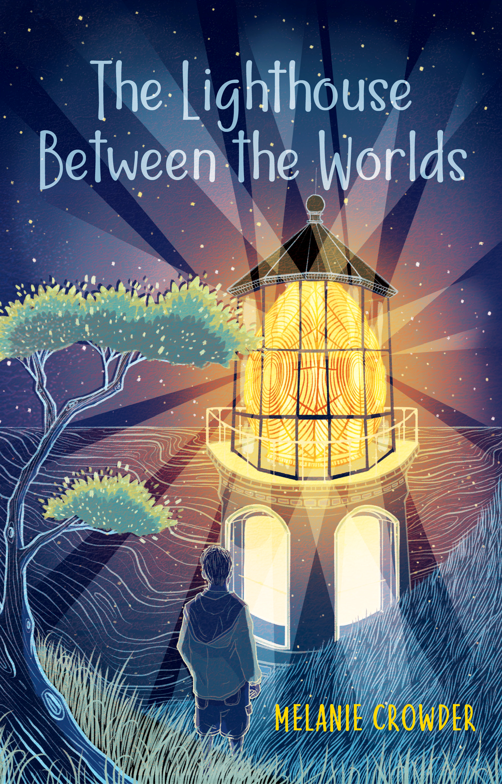
But you didn’t come here today to mock my 5th grade artwork. (Though trust me, I take absolutely no offense if you do!) You’re here to see some truly amazing cover art by Kailey Whitman. For the first book in the duology, she created this lovely vision, hinting at the otherworldly adventure readers would find themselves immersed in.
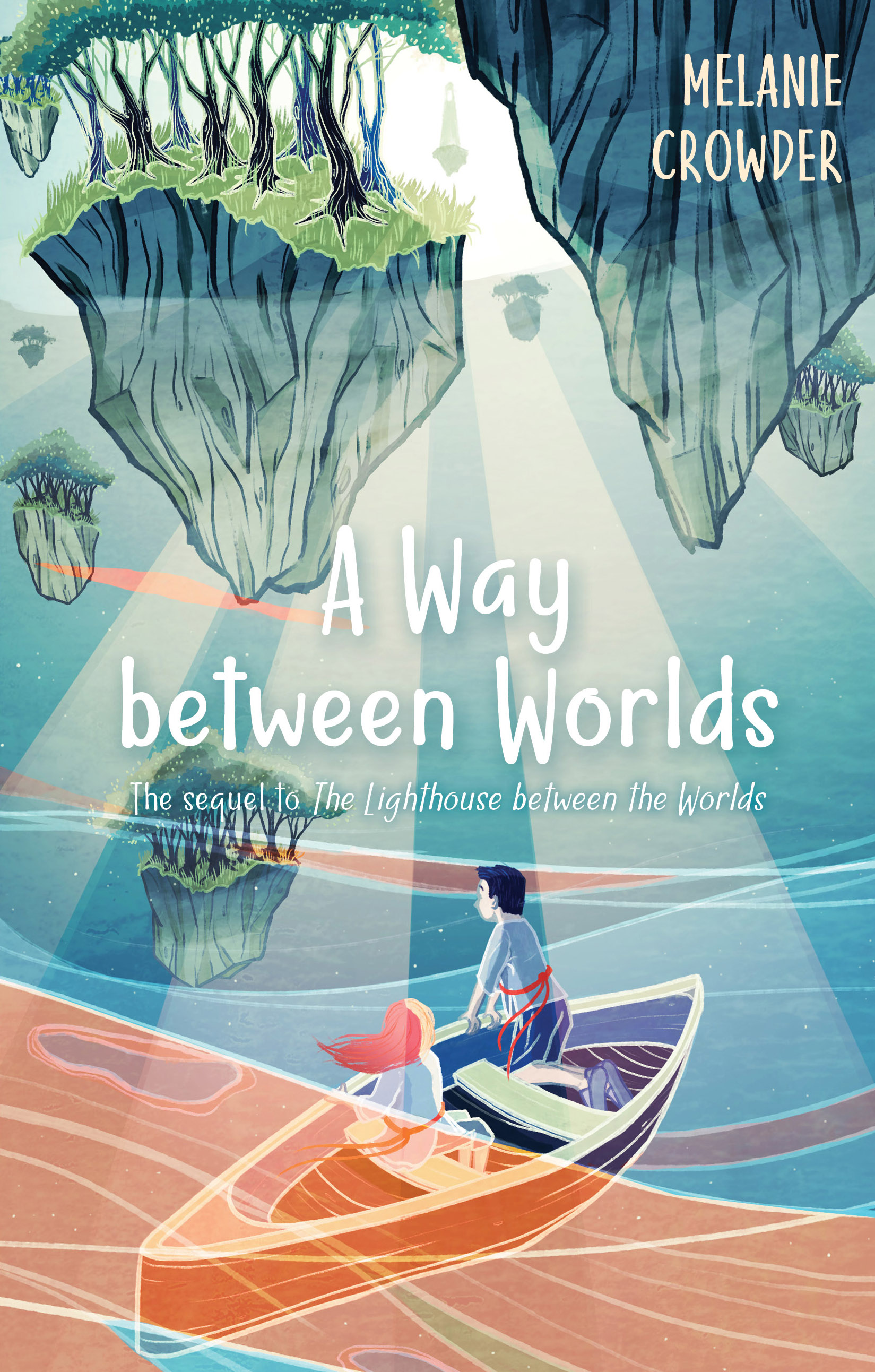
And for its sequel
(drumroll, please…)
when readers are eager to leap into more of those parallel worlds,
this:
I love it. I hope you do too!
This duology is the first time I’ve ever written a book that isn’t a standalone. And let me tell you—it’s a thrill. Just look at the two covers together! I can’t wait to hold those books up side by side.
I don’t have long now to wait—A Way between Worlds releases October 1. I’d be so delighted if you’d order your own copy (extra points for supporting your local bookstore or library) or a set for the young reader in your life.
Thanks for sharing this celebration with me!
—Melanie
www.melaniecrowder.com
*Check out Kailey’s illustration portfolio and for a daily stream of inspiration, follow her on Instagram!


